The CoView Manager
The CoView Manager is where you control the display of elements, data and annotations in the CoView. It is also where you apply styling to the various objects that are displayed on the canvas, which is the working area visible in the CoView.
It can be opened via Workspace > Panes or by pressing Ctrl+F11 on your keyboard. When you open a new empty CoView, the CoView Manager opens automatically, although it does not display any content yet.
The CoView Manager is divided in two sections:
- The top part of the CoView Manager is the Selection section, where all objects available for display are listed. These objects are organized into tabs: framework elements in the Framework tab, data in the Content tab and annotations in the Annotations tab.
- The bottom part of the CoView Manager is the Display settings section, where all display settings are specified for each object or object type. When you change any control in this section and press Tab on your keyboard, the map updates immediately.
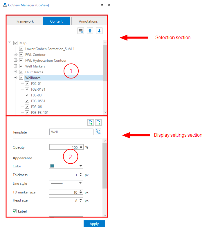
The CoView Manager is where you control which objects are displayed on the canvas and how each object is displayed. click to enlarge
The framework tab lists the framework elements that are selected to be displayed on the canvas. When you open a new CoView, the Map, North Arrow and Scale Bar elements are listed by default.
The two most important framework elements are the map and the cross section. These elements are used to visualize the data of interest, also referred to as the technical content. The other framework elements are used to build the legend.
All elements listed under the Framework tab will be part of the Framework once you save it with the Save button  in the toolbar.
The elements listed in the Framework tab always correspond to the currently selected framework. When you select another framework, the list is updated automatically. Frameworks are saved and stored in the Framework Manager. Here, you can create, duplicate, rename, import, export and delete frameworks. For more information, see Creating a framework.
For each framework element, you can adjust the display settings in the Display settings section of the CoView Manager. The Display settings section updates automatically based on the currently selected element in the Selection section. When you select an element, it is highlighted in blue. The selected element is listed at the top of the Display settings section.
At the top of the Content tab, the primary object Map is listed by default.
When you start building the technical content of your map, e.g., by selecting which data to display, you add data by checking the relevant checkboxes in the JewelExplorer. Once an item is selected for display in the JewelExplorer, it is also added to the list under the Content tab. You can then use the Content tab to show or hide data in the CoView by checking or unchecking the corresponding checkboxes.
Once the data is displayed and the map element is active (highlighted in blue), you can use your mouse to navigate the map. The scroll wheel allows you to zoom in and out, and holding the left and right mouse buttons allows you to pan.
All objects selected for display are displayed on the map in a specific layered order. The first object you select becomes the base layer. Any object you select afterwards, is displayed above the previous one. This layered structure is also reflected in the order of objects listed in the Content tab. Items at the top of the list correspond to the lowest layers on the map. You can change the order of layers using the move up  and move down
  buttons in the toolbar.
All objects and object types listed have a context menu with the following options:

|
Show All Show all the objects. |
|
Hide All Hide all the objects. |

|
Template Manager Open the Template Manager where you save all the templates. |

|
Create Template Create a template using the current display settings. |

|
Apply Template Select a template from the list. The selected template is applied immediately. |
For wellbores, well markers and point sets you have the context menu option to create bubble plots using the  Bubble Plot Tool. For wellbores, you have an additional context menu option to manage the time steps of the production data bubble plots, using the Bubble Plot Time Control tool.
For each framework element, you can adjust the display settings in the Display settings section of the CoView Manager. The Display settings section updates based on the currently selected element in the Selection section. When you select an element, it is highlighted in blue. The selected element is listed at the top of the Display settings section.
For each object or object type, you can adjust the display settings in the Display settings section of the CoView Manager. The Display settings section updates automatically based on the currently selected object in the Selection section. When you select an object, it is highlighted in blue.
To customize the appearance of an object, uncheck the Default settings option and then modify any setting according to your preferences.
To save time, you can save the display settings per object type in a template, and apply the same display settings whenever needed. Templates are saved and stored in the Template Manager , which you can access from the toolbar of the Content tab, or via the context menu of the listed objects.
Building up the technical content for the cross section(s) is also done in the CoView Manager. For detailed information, see Framework element: Cross Section.
The Annotations tab lists the annotation elements that are selected to be displayed in the CoView. Annotations allow you to place elements either at a fixed geolocation on the map or at a fixed position on the canvas. You can control this behavior by setting the Relative to option (under Position) to either Canvas or Map. This option is unique to annotations.
Annotations belong only to the CoView in which they are created and are not saved to the framework. If you want an element (e.g., text, an image, a view, a chart or a shape) to appear only in one map and not in every map that uses the same framework, you can add it as an annotation instead of adding it as a framework element.
For example, you can add a production chart as an annotation and set its position relative to map so that it is tied to the geolocation of a specific well shown on the map. When you zoom in or zoom out, the chart will remain positioned next to the well's geolocation.
The Annotations tab has a toolbar with the following options:
|
Create new folder Create a new folder at a deeper level. |

|
Delete Delete the folder from the solution. Subfolders or objects it may contain are deleted as well. |
Annotations are by default saved in a folder. Both the folder and the annotation itself have a context menu:
New Folder Create a new folder at a deeper level.
Crop (only for view annotation) Crop the view annotation. Blue cropping handles appear on the edges and corners of the view annotation. Left mouse click and drag inward to the required size. Open the context menu of the view annotation in the CoView Manager again and select Complete Cropping. You can enlarge a cropped view annotation again by dragging the handles outward.
Complete Cropping (only for view annotation) Crop the view annotation.
Duplicate Duplicate the object. Depending on the type of object, subfolders or objects it may contain are duplicated as well.
Duplicate to CoView Duplicate the object to another CoView. All available CoViews are listed. Depending on the type of object, subfolders or objects it may contain are duplicated as well.
Delete Delete the object from the solution. Depending on the type of object, geometric representations, subfolders or objects it may contain are deleted as well.
After selecting an annotation in the Selection section (highlighted in blue), use the Display settings section to select an image or a view, or type the text that you want to add. You can then adjust any of the available display options to customize the appearance of the annotation. You can also rename your folders here.